It’s the international dull…. so what is there to Rant about?
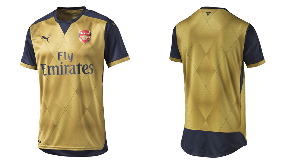
There was a discussion on here the other day about the Arsenal new Gold away kits. Some like it, some think it looks dirty. Peaches thinks it looks ‘mean and dirty’. Well she would, wouldn’t she 🙂
It got me wondering about how these shirts are conceived, designed, agreed upon and then go into production. Who has the final say, Puma or the Arsenal? Does Wenger have input into the final product? Do the players have a say?
I’ll say right from the start, I don’t like it. It’s not the colour, I think gold is an excellent choice, but it’s the way our shirts look…. they look dirty and when a player has perspired a bit, it looks even dirtier. Who ever came up with the idea, it was a good one, but somewhere along the production line it seems that the material used isn’t right for its use. As someone who uses colour in paintings regularly, I know how difficult gold as a pigment can be. From a tube it can be dull, not like the gold you would expect. Alternatively, using gold leaf produces an excellent colour. So how did we end up with a gold that looks like a dull, dirty gold?
Psychologically it’s a great colour:
The color gold is the color of success, achievement and triumph. Associated with abundance and prosperity, luxury and quality, prestige and sophistication, value and elegance, the psychology of this color implies affluence, material wealth and extravagance.
Gold in its physical state, by its very nature, denotes wealth and prestige in every country, culture and market in the world today – it is probably the most valuable and easily traded commodity available in the global marketplace.
This color is linked to masculine energy and the power of the sun, compared to silver which is associated with feminine energy and the sensitivity of the moon.
So how did we get the current material and why does it look so dull and dirty?
It probably started with some pimply kid just out of Art and Design college, employed by Puma on minimum wage, he/she draws a few ideas, chooses a colour and that goes to the next level of the design team. A few Puma employees then make a decision that it’s good and a prototype is produced. Then it’s probably presented to Arsenal FC for their approval. All good so far….. but I think something went wrong between the idea and the final product.
Before the modern shirt of polyester was conceived, shirts were first made from wool, and then cotton. Heavy and made worse by get soaked with sweat. Polyester has revolutionised shirt material and now it takes sweat away from the body, polyester is light weight, durable, resistant to creasing and only absorbs about 4% of its weight of water, so most sweat is carried along the fibres and evaporates.
So why do our new gold shirts look sweaty and dirty. I think there wasn’t enough thought put into the colour and how it looks after just 20 minutes of running around a football pitch. As I said, gold is a difficult colour to work with and someone within the production team failed to take this into consideration.
Which leaves me with my final thoughts….. I like the idea but I don’t like how it looks on our players. I think it should go back to the production team to sort it out. Or maybe the psychological affect of Gold is making us play the way we did against Man United…. oh hold on, we played in the Red and White that day.


 Posted by Rasp
  Arsenal News 24/7
